
This is a pen and charcoal drawing I did of Samwise Gamgee from Lord of the Rings. I’ll explain how I drew it.
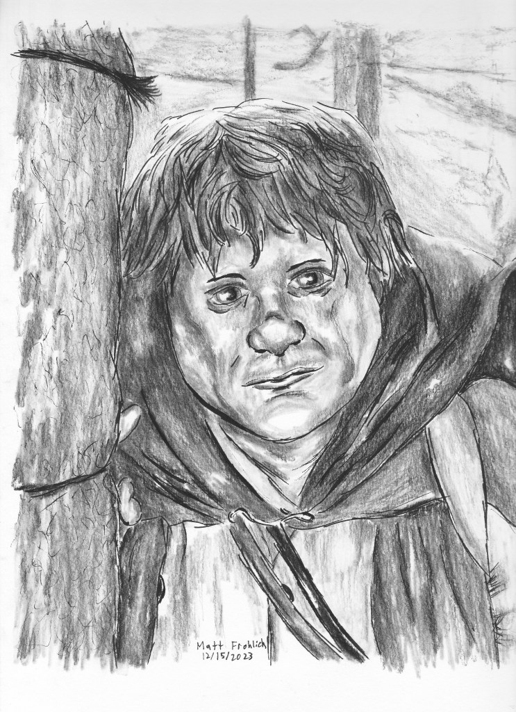
I used a reference drawing for this, specifically it is from one of the end scenes of Lord of the Rings: The Two Towers. It occurs just after Frodo, Sam, and Faramir narrowly avoid allowing the Witch King of Angmar to capture the ring. Sam in return stares off into the distance and contemplates whether their quest is worth pursuing or not. Below is the finished product.
One thing I like about this art style is how high quality pictures can be made with a very low budget. This only required some very basic art supplies and a standard Windows PC, although a phone could be used in place of the computer instead. I prefer the computer since it gives me a larger screen to display the reference photo.
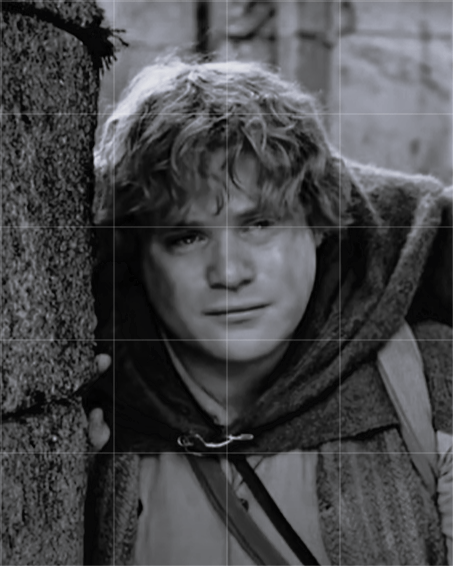
First I had to create a reference photo. I played the scene on my computer, and maximized the screen size to allow for higher quality. I then paused the scene at the part I wanted to use, and used the Snipping tool (available as standard software on Windows PCs) to capture an image. Windows allows you to apply basic effects to images, and I changed the reference photo to black and white since I was making a black and white image. From there I found a website that allows you to apply gridlines to images. There are numerous websites that do this, along with free apps that are available on your phone.
The purpose of gridlines is to help with copying the reference photo. In this case, I gave the reference photo 4×5 gridlines, since I was drawing this to fit within an 8×10 picture frame. I drew the similar gridlines on my paper of 2″x2″ squares. I lightly drew it with a 3H pencil so that I could erase them from the final product. The gridlines greatly assist with drawing since it gives you an idea of where to draw every part of the image on your paper. However, it’s only a tool and it still requires drawing talent to properly capture the reference photo. Even with the reference photo, you can see that there were some subtle differences between my picture and the reference photo.
I think there’s two different philosophies when it comes to copying reference photos. One is that it’s an analytical process, and you should copy exactly what you see in the reference, and that any deviation is an error. The other is that you should draw more quickly and be less concerned with any differences. I think both have their place, and it’s best to find a balance between the two. The first philosophy is easier to understand, but not so much for the second. The benefit to the second is that it allows you to draw from the subconscious part of your mind. This can be helpful in that it allows you to correct any errors that may be present in the reference photo. For example, maybe a subject’s pose could be more appealing if it was altered slightly, or it could look better if the lighting was altered.
I like this art style because of how simple it is. I used Artistloft artist pencils and a ruler to do the gridlines and the initial rough sketch. I used a 3H pencil so that the lines were lighter and easier to erase. I used a kneaded eraser. I used Pigma Micron pens to do the ink (sizes 08 and 10), and Windsor & Newton charcoal pencils for the charcoal. Finally, I used Canson XL mixed media rough paper. I got all of these supplies from a local Michaels store, and they all cost less than $50. I could easily make many pictures like this with these supplies before having to buy more.
